The New Website
The website re-design visually and dynamically captures the deep meaning behind The Spirit of SAR (SoS). The logos, the visual elements bring semantic content that is intentional and purpose-driven, personal, ethically-grounded and service-minded. This is reflected in the unchanged SoS Core values.
SoS visual elements & logos
Compass -- Most striking, perhaps, is the SoS rotating compass found in header and/or footer sections of the website pages. The cardinal marks and the compass represents clear direction. Symbolically that direction is the positive change needed in SAR, the constructive projects and goals of SoS for the global emergency response sector, and for the global public interested in pursuing response as a career.
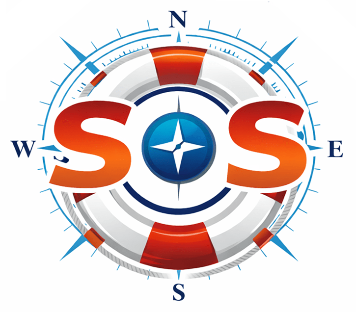
The SoS Logo - Unchanged for now, The compass cross is seen in the center of "SoS" as a lower-cased letter 'o', distinguishing "SoS" from SOS. The surrounding life ring buoy and its tangentially but externally-concentric compass marks symbolizes the life-saving and safeguarding purpose as well as the clear directions navigating us to fulfill that purpose. The variety of directions simultaneously symbolizes the diversity of SoS projects, services, products, and initiatives.